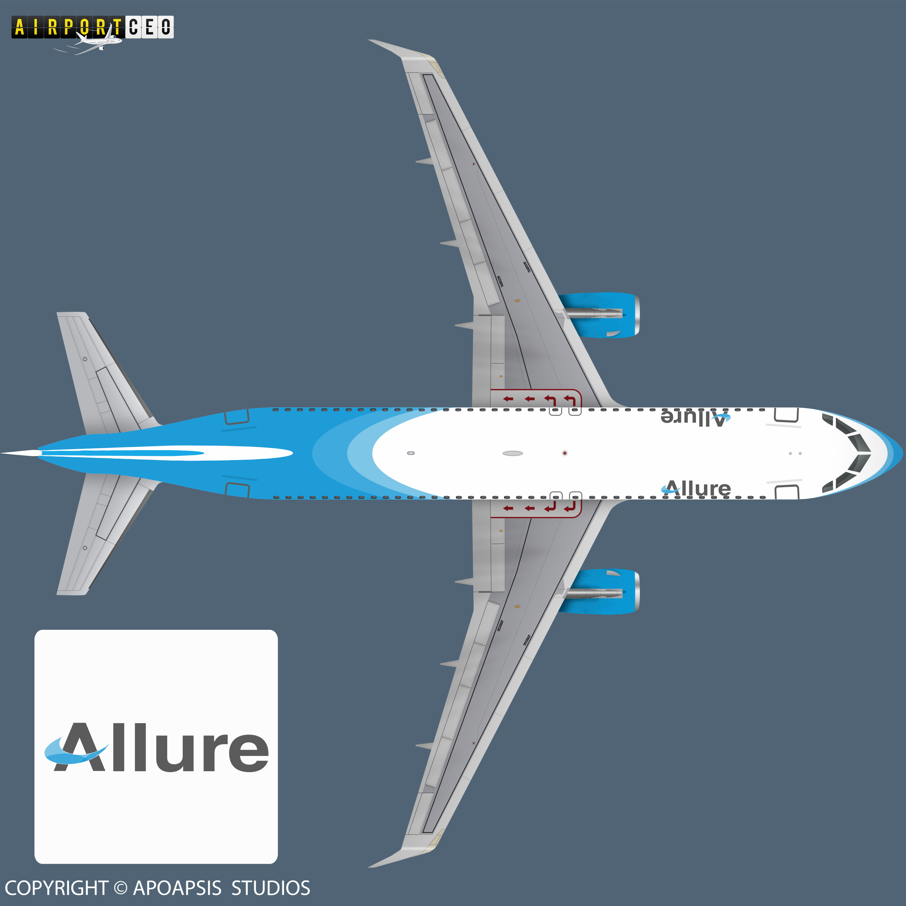
Airline Description: Allure is the luxury airline. Companies catchphrase:Fly Allure, Fly in style!
Started in the booming 60`s the company grew rapidly and by reaching the 21 century they expanded to the upper class of the economy, offering one of the most exclusive flight. Next to the wider seats, more legroom and bigger overhead compartments, they offer 110V/230V connections for your electronic devices. Also all food, drinks, entertainment and wifi inclusive, for all classes.
It’s kind of interesting to see how a livery can be close, but pretty different from another airlines livery. It looks a lot like the Pacific Air livery. And you know what, that’s perfectly fine! Great job! Your logo I really stands out. It’s very simple yet, nice.
One thing I think you could have done a lot better with is keeping the original gradient. The design looks great, but since that gradient is gone you loose the roundness effect.
So I updated the design, had some spare minutes left…
Added some gradient to the fuselage of the plane, I didn’t want to add too much, so I went very subtle on it.
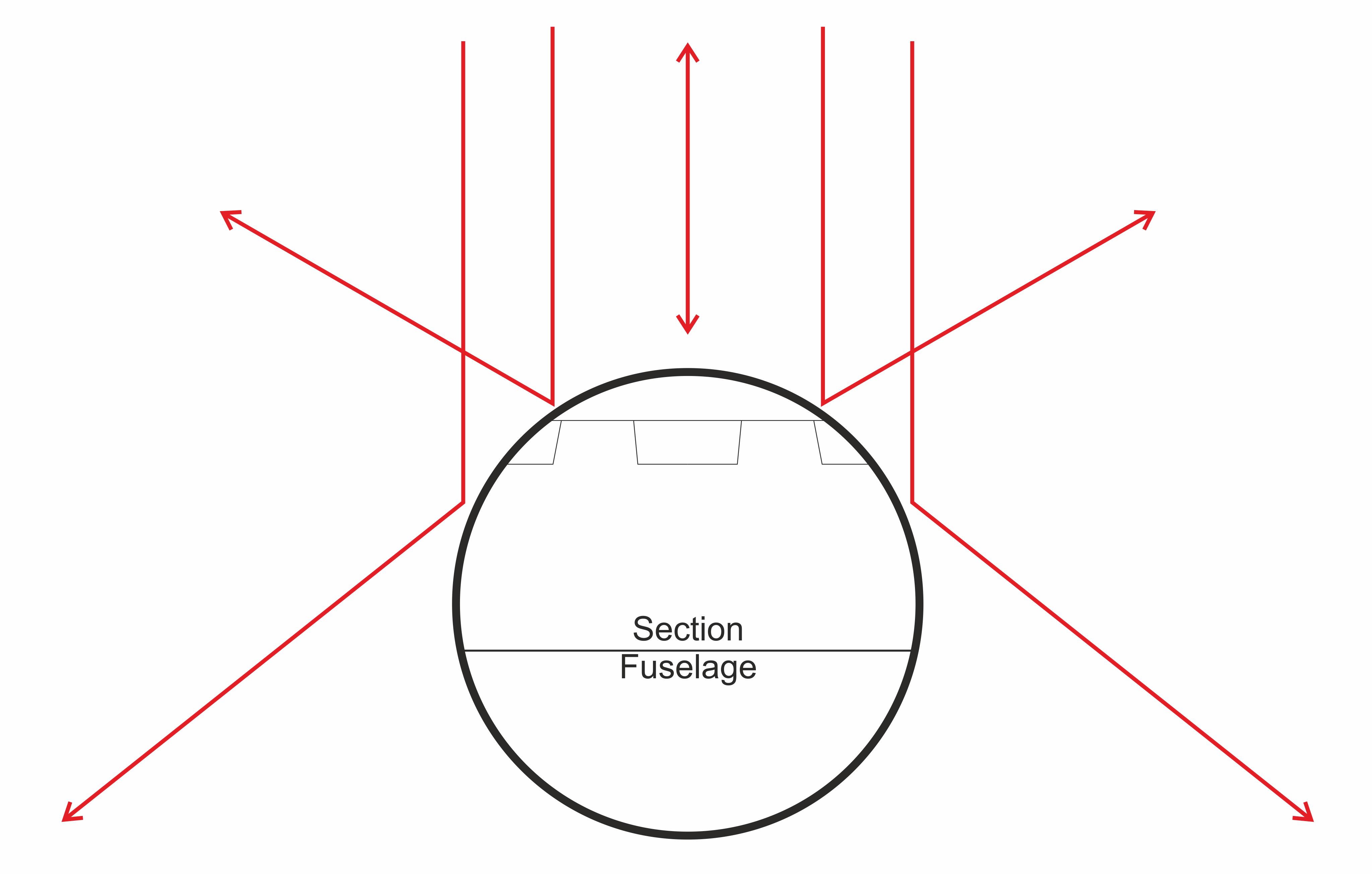
It’s the 3D effect of the fuselage, the top of a round item gets more light reflection, as it is facing directly towards you more towards the sun, the sides of the fuselage is not facing directly towards you also getting less sunlight (no dynamic sunlight reflection, different story), less light gets reflected towards you, so the edges are therefore darker.
The drawing is a bit simplistic… but it will do the job.


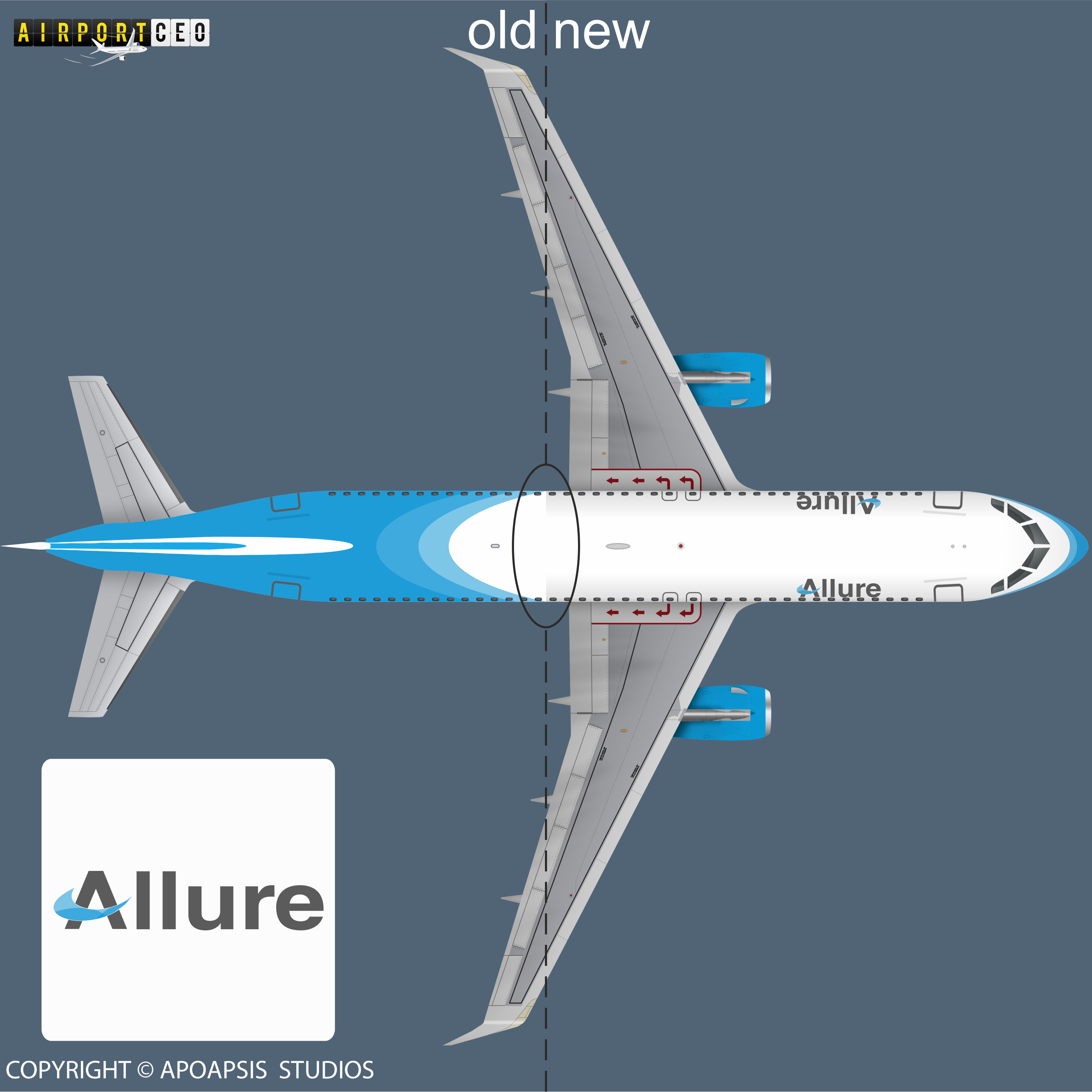
 Now I see, and it looks way better.