Here’s a little suggestion to make the game a little more friendly towards people who are colorblind. First of all, colorblind rarely means you can’t see any color. It simply means that it’s sometimes hard to see the difference between two colors.
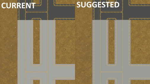
In the game I noticed that concrete is very light grey. At first glance this shouldn’t be a big deal. However, the yellow lines can be hard to see. This becomes harder the further you zoom out, making them hardly noticeable on the furthest zoom level. (in other words, there’s not enough contrast between the light grey concrete and the yellow lines)
Therefore I suggest to make concrete slightly darker, not much. In the image below, I made the concrete 5% darker which made a huge difference. The yellow lines are now perfectly visible, even for those who struggle with colorblindness. (It’s only the concrete, the asphalt remains unchanged)
Well as a colorblind myself I would love some “compatibility features” !
Though each colorblind see differently and have its own issue, in my case there are actually many colors I mix, like Yellow and Green, Orange and Red, Orange and Green, Blue and Violet, Pink and Red, I can see blue but some light blue appear grey (as if I could not see it) to me, and many more.
In the game what I personally struggle with is the time speed buttons, I need to really stare at it to make the difference between the selected speed and the others, I can’t see the difference between green and yellow easily (if that’s the color they are ?).
Same with the satisfaction icons, I would really appreciate if when we put the cursor over it said the percentages of satisfaction for each of the 3 category and the total in the last one rather than telling the names (which is pretty useless IMO).
I don’t even think I am colorblind, I might be “shadeblind”.
On the other hand, I could see clear difference between two shade of red that my non colorblind girlfriend could hardly tell appart.
But I admit there is a noticeable improvement in the line visibility in the second image, in the first one it appear blurry to me and more clear in the second one, not a huge difference for me but for sure this is an improvement !
Well someone who can’t see the difference between Red and Blue probably should be called Colorblind while someone who have trouble with colors close to each others like Red and Orange or Yellow and Pink (depend which one anyway, as light orange is identifiable over a dark red obviously, but don’t tell me to spot the difference between Scarlet #ff240000 and Burnt Orange #CC5500 and I can’t tell of Violet #8F00FF is actually Violet, Blue or Pink…) might rather be refer as Shadeblind.
And please, no one mention THAT dress, I don’t even know what color I see it.
I always thought males only could see in 8-bit color mode? And what are mauve, turquise, beige or lilac anyways? I can eat salmon, why is it a color? ARGH!
Irony cast aside, the OP made a serious problem visible (no puns intended). The UI not only must be intuitive, but the the help for the colorblind should be in the game.
I recall some elements from a similar discussion for Factorio some time ago which essentially concluded into a “we will try to do something but there are so many types and levels of colourblind that there will always be an issue for someone”.
I am going to revive this topic. I do think this is something that could be added. Gets my vote. Also, personally, I like the 5% increase in darkness. I enjoy that from asphalt to concrete, it is less of a strain on my eyes. Although I am not colorblind, I do enjoy this idea and hope it is implemented. I would also like it if some of the floors that are bright such as the first floor in tiles, be turned a little bit darker. It is very irritating to my eyes. I don’t know why though. My almost 1000 hours looking at Airport CEO probably.
the problem with build menu - i had problems seeing the icons against the background because its very bright
in SA - darker tones are used for ease of finding things