That is just breathtaking and so realistic! Thank you!
1 Like

Wow! So many cool designs! 
2 Likes
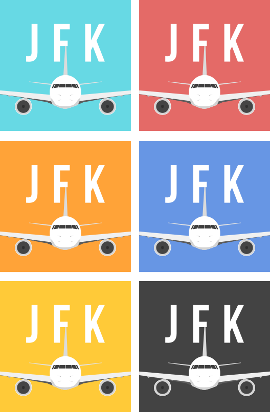
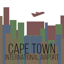
I’ve designed a badge treatment loosely inspired by vintage seals and luggage tags, with several variations based on the “size” of the airport (as well as an overarching one). This is actually my very first post, so it’s only letting me post one image — bear with me while I get all the variations up. Thanks (:

Summary
Font used: Bebas Neue Regular
Font color: #232320
6 Likes
I do have them saved out as individual PNGs, but posting one combined image seems to be the easiest thing for now.
13 Likes
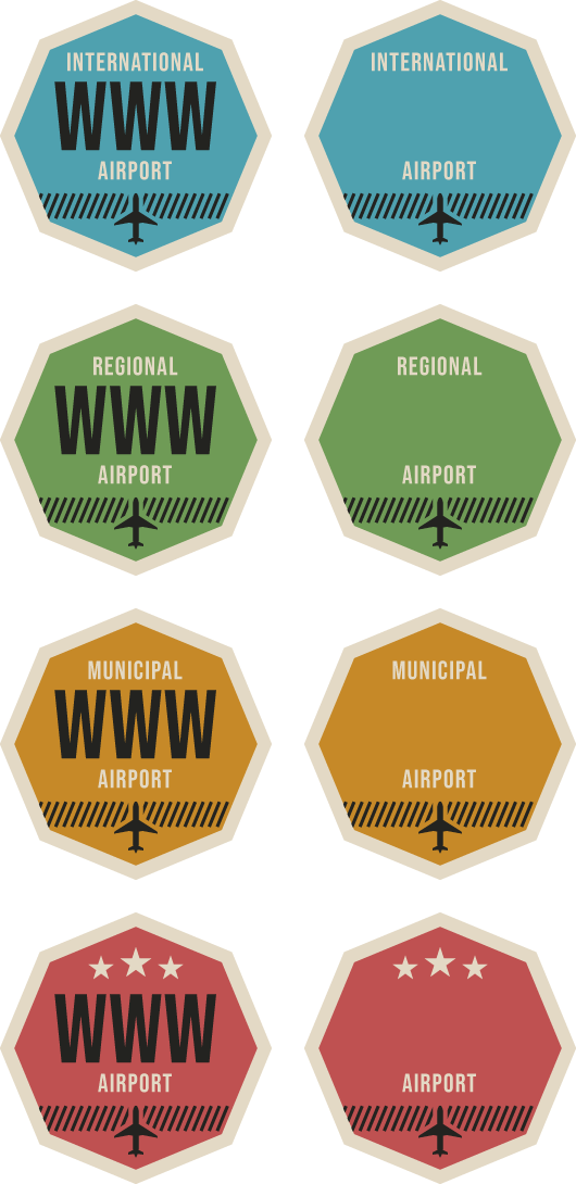
Here 1 more


Summary
Font for IATA
Font: BebasNeue Bold
Font Color Hex: #30ddfc
Font Color RGB: 48,221,252
11 Likes
Lol it looks like a guitar pick.
4 Likes

2 Likes
OOh nice
Note: I don’t have Open Sans ExtraBold, SemiBod, or Light. Shown is (I think) Open Sans Regular. Please change it into Open Sans SemiBold. If that is not possible, please ignore my submission.
Thanks!
2 Likes
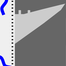
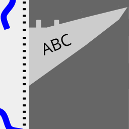
My next one is the below inspiration from an engine, i think it is missing something but not sure what!

3 Likes
Maby a dark ring around it to make it look more like an engine
1 Like
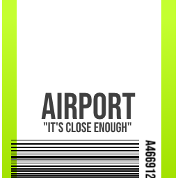
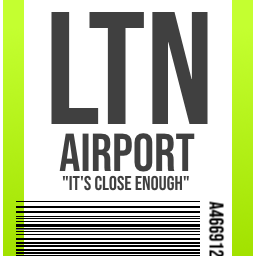 It’s a masterpiece - Based on the classic green and white luggage destination tag, instantly recognisable by any traveller.
10 Likes
Part 2 of my last post (Apparently I can only post one image at a time?)
7 Likes
great idea for a logo! I like it!
1 Like
Nice one, have been toying around with this idea myself! But you’ve beaten me to it!
4 Likes
I’m a ramp agent, so these tags are all I look at all day long. As soon as I saw this competition I knew it had to be done. 
4 Likes
I’m currently a gate / ticket agent, so those bag tag ones caught my eye as well!
3 Likes